New blog style
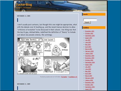
I’ve been testing out Movable Type 3.2’s new StyleCatcher plugin, which allows you to change styles at the drop of a hat. Sounds like an interesting prospect, but I’ve previously half embedded the styles in the web page itself, and half used a stylesheet (I know, my bad), and the results with StyleCatcher are horrible. So I’m trying out some new page templates, and they seem to work well with the new stylesheet. I may leave this for a couple of days, tweaking it and refining it, until I’ve got something I like. It’s a bit more grown-up looking, and a bit less garish than my previous page — that’s why I hesitate so. I enjoyed the previous garishness. Made it seem more fun.
I don’t know. I do like the new colours a little better, and putting my car in the banner is still pretty immature of me. What do you think?


 Previous Post
The new style’s a lot cleaner than the old one, which I like; busy web pages can get annoying after a while.
I’m not sure about the semiotics of juxtaposing “Power to the People” with a photo of your car. Some sort of implication of the degree of personal freedom that an automobile represents? Or are you just inviting the Internet out for a spin?
Yeah, I know. Looks more like a car ad with that picture in the header. To be honest, I was stumped for pictures, and put this together in a bit of a whirlwind. I was scouring my images folder for suitable pictures, and the car pic (you know I love my car) had the most negative space. I’m currently looking for other pictures — maybe adapting some of the current “chickie” themed headers for that spot.